Colours play an important role in boosting one’s health and well-being. It has a lot of effect on one’s emotions and behaviour. Choosing the right colour can make your space feel comfortable by modifying the temperature, making your place special and intimate and brightening the dark areas. This article emphasizes the trending paint colours in Toronto and their effect on a person’s behaviour, mood and emotions.
Colour is one of the key elements in interior design. Painting your room with the right colour can make the room more noticeable by creating a proper backdrop and adding texture and structure. Adding contrast with a darker colour can create visual interest in the room’s design. It is advisable to spend some time and decide on the colours to be painted in your room as they can affect your emotions by enhancing the room’s freshness if the colour is chosen wisely.
Some proven facts about colour psychology show that colour affects a person’s behaviours. Sometimes when we go to certain places, we feel very calm and relaxed, whereas some places make us so much irritated and annoyed. If we observe, colours in those places may affect our mood. As per the studies, colours are often interlinked with a person’s emotions. For example, there is an increased heart rate for the people looking at red colour and vice versa for lighter colours.
There are two types of colours which are associated with psychological effects.
Warm Colours: Colours like orange, Yellow, and Red can reflect emotions like hatred and anger to comfort and love.
Cool Colours: Colours such as purple, Blue and Green often reflect misery and serenity.
By applying these colour strategies in daily life, you can re-decorate or re-paint your room, which may enhance your mood and emotions.
Every year colour trends will change constantly. Colour experts in well-known paint brands choose their “Colour of the Year” and put it in their colour forecast. The following are some of the colour trends of 2023.
Raspberry blush is perfect for bedrooms, dining areas and bathrooms and works well in the kitchen. It is a chirpy coral with a tinge of pink. It can be coordinated with neutrals like taupe and beige, drawing attention wherever used. It is the colour of the year for Benjamin Moore.
Redend Point is the colour of the year of Sherin Williams. The beauty of nature inspires Redend Point and can be used in any of your rooms, including bedrooms and bathrooms. This earthy and neutral shade is perfect for those looking for a dignified and luxurious look. This colour is intended to be calm and comfortable, giving a modern touch. Although underrated and subtle, it gives your room a fresh look.
The black canvas is suitable for new homeowners who don’t prefer anything bold or glitzy kind of colours. It can be used in any space as it is one unique shade of white. It makes your home look spacious and look simple yet classy. It is easy to maintain and gives you a modern look if paired with neutrals like beige, grey or black. The black canvas is the Colour of the Year for BEHR.
Valspar has chosen 12 colours as Colours of the Year for 2023 as they inspire creativity and make decisions about their home according to their needs.
The palette includes the following colours.
• Cozy White – White and a tinge of yellow
• Villa Grey – Calm grey with a touch of warm yellow
• Rising Tide – Light, Soft blue
• Gentle Violet –White combined with faint violet
• Holmes Cream – Bronzer with a touch of yellow
• Ivory Brown – Faded brown inspired by nature
• Blue Arrow – Aegean blue with a touch of yellow
• Green Trellis – Fuzzy and two-toned green
• Desert Carnation – Weathered natural terracotta
• Southern Road – muted clay tone with a touch of brown
• Flora – Dark olive
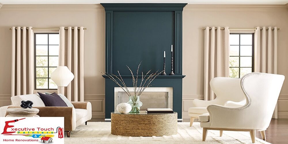
• Everglade Deck – Dark navy blue
Viva Magenta coordinates with anything and helps us to create a fun environment in our home. The colour itself indicates vibrance, positivity and happiness. It is strong, and the red shade draws attention with its freshness. Viva Magenta is Pantone’s Colour of the Year for 2023.
The initial step of painting the interior of your home is being prepared with the colour options. If you want to make your interior look stylish and modern, Here are some popular trends for a perfect and successful interior paint job.
Bright colours in your room can impart a gentle and relaxed mood. They make the room look spacious visually. Bright colours like green and yellow give us a joyful feeling. Grey and white are also suggested to achieve a classy and elegant look.
Dark colours provide confidence and strength. Compared to light colours, dark colours are mostly preferred for decorations, highlights and also for applying to furniture and also for large living spaces
Neutral colours can be used for any colour combination. They offer a gentle and peaceful ambience for any living area.
Accent paints are small shades used to enhance or uplift the whole area. Light paints always match well with deep and dark colours. If you want to avoid risk, use neutral colours to match with other colour palettes.
The outside paint of your home will majorly affect the visitor’s first impression of it. Choosing exterior colours wisely is important, whether just changing your home’s appearance or hoping to enhance curb appeal before selling.
You should know the colours and paint finishes suitable for your building style. It looks best for everyone in the community if your colours work with the overall environment. Always opt for colours which are different from your neighbouring homes; go around your neighbourhood and take a look to get ideas.
There are several building supplies on and around your home that painters won’t touch. This might include the driveway, a patio, walkways, and roofing tiles. Take these materials into consideration and pick colours according to them.
When painting their homes’ exteriors, homeowners frequently lose their ability to experiment and introduce changes. Select a colour palette to work with rather than simply one colour. Darker colours work incredibly well to paint precise architectural details that deserve highlighting.
Colours can look different when applied to different building materials and when exposed to the sun. So, do a patchwork to ensure the colour looks good and you are satisfied. Do not simply believe the sample colours provided for accurate representation.
Professional Residential & Commercial Painting crews in Toronto, York Region, and Durham region benefit from using Zero VOC, Low VOC, Certified Green & Natural Paints.
Many paint companies believe that these companies are believed to be environment-friendly options. But the reality can be different as these paints can contain HAPs. To increase the measurement, they add colours to some low VOC paints.
Certified green paints are free from plastic elements and vinyl substances and don’t include any toxic substances. They have fewer VOCs than conventional paints and have little or no environmental impact. These paints have a seal on their containers for identification.
Natural paints are the most environmentally friendly paints. These paints are most commonly used in the 18th and 19th centuries and come in a powder form in which we need to add water before applying it on surfaces. They are generally made from non-toxic pigments, lime and milk proteins. They are also called Casein paints and have very limited colour choices. They aren’t durable compared to conventional paints.
Ultimately, It is important to know that colours play a major role in our day-to-day life by enhancing our mood and peace. Choosing the right paint colours can be a reason to maintain better mental health. Various colours are available in the market depending upon our wills and fancies. Executive Touch Painters has over 30 years of experience in painting and renovation services in the Toronto area and GTA. We guide you regarding your home paint by considering all the factors and suggesting according to your needs and budget. Feel free to contact us for a free estimate or call us at (416) 410-0164.